Login button
This page demonstrates the placement and behavior of the login button
Placement
Without search


With search

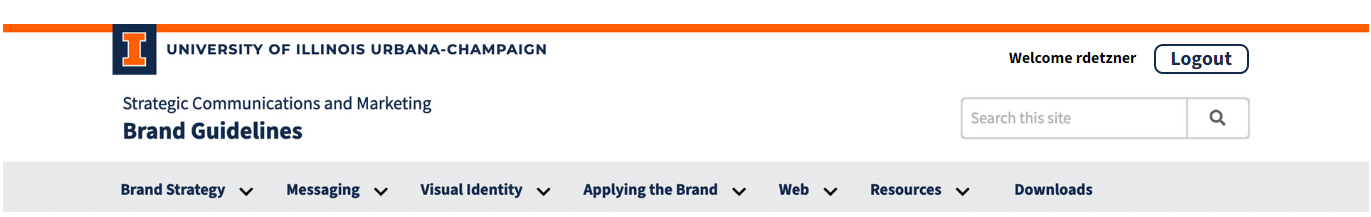
Button Behavior
The button has a blue background, with a change to white upon hover-over. There is a momentary change to orange when clicked, and the work 'Login' is changed to Logout' A welcoem message is displayed next to the button
Accessibility Guidelines
Describe accessibility concerns and requirements with the item, as well as any best practices.
Instructions
This login standard is defined in 2 parts, a button with the class of 'ila-login-btn' and a span with the class of 'ila-login-btn-welcome-message'.